You may organise events for different reasons – to build community, to inform or educate, to establish thought leadership in your field, and so on. Having all your event details set in stone is already quite the task in coordination, but marketing it is equally (if not more) important.
Part of marketing an event is in communicating its value effectively to entice people to want to spend the time and money to attend. Why should they care? That’s precisely what you need to convey on your event landing page which will be the first thing they see as they evaluate whether or not to click “Buy Ticket”.
Here are nine ways to create the perfect landing page that converts browsers to buyers.
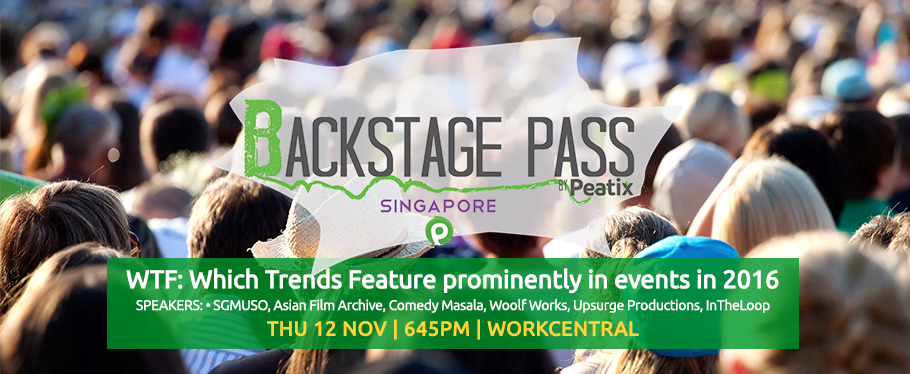
1. Have an event banner that says it all!
Choose a banner image that correctly depicts your event’s vibe and theme, and include the key information for buyers to make a quick decision on ticket purchase – the event’s name, date, and venue. In communicating this, people can decide if your event is relevant or interesting.
2. Create an event title that stands out
Keep your target audience in mind and write an event title that’s unique and punchy to capture their attention, yet relevant and informative (e.g. Turn the World into a Website by Hyper Island). You could also use familiarity like including the names of well-known people, institutions or an event series (e.g. TEDx).
3. Use more visuals!
Use images, videos, slideshows, or infographics to communicate why your target audience should attend. Given we typically have less than a second to get someone to form a good first impression and stick around a webpage, using visuals will be important in first grabbing their attention before elaborating with text.
4. Address what your event is about in the first line of your event description
In our multi-sensory fast-paced society, people want to know what’s in it for them, and quickly. Make sure you have the key details down in the first line – your event’s purpose or what your target audience will get out of attending the event.
5. Use formatting to distinguish between sections within your event description
Make your font bold, type in capitals, underline, use bullet points, or a different colour! Formatting helps your reader to skim through your description and focus their attention on sections that would matter more to them.
6. Add links sparingly
You want readers to stay focused on your event page instead of clicking out to another website. So unless necessary, do not include links within your event description. If you have to, keep them towards the bottom. If a reader reads all the way to the bottom, you’ve probably won their interest by then anyway.
7. Create clear differences between the ticket category options available
Use differential pricing or bundling of the ticket with other goodies such as merchandise, and communicate these differences clearly. This helps your audience to easily distinguish between tickets and make a quicker decision to purchase.
8. Be clear about your event’s location
This includes providing directions from familiar landmarks (e.g. 5 minute walk from City Hall MRT Station). It may seem trivial but makes it simple for attendees to visualise getting to your event and easily plan on attending it.
9. Highlight your partners and community
Doing so adds to your event’s credibility. Furthermore, your event probably couldn’t have happened without them. Value and showcase who they are, what they do, and how they’ve contributed to your event.
Armed with these nine tips, review your event landing page and see if it checks the boxes.
This article was first published on The Hubbington Post.


