Although it’s what’s on the inside of an event that counts the most—the event’s character, ambience, tone and vibe—the look of your event page should by no means be dismissed as superficial and vain. Because when it comes down to it, humans and their event pages aren’t all that different, and you are at least going to be a little reluctant to hit up an event that looks like very little effort went into the event page.
But let us start from the beginning. What exactly constitutes an event page? The answer can be remembered now and forever with this mnemonic that has been employed for centuries: TDTDT, or Title, Description, Time, Date, Ticket info. With these five pieces of information and nothing else, you can create a perfectly acceptable, if rather dull event page:
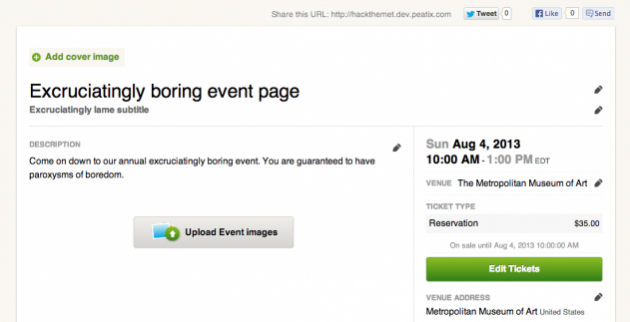
To freshen the page up, take you mouse and point it with haste at the “Add cover image” button. Now click. Now upload the photo from your desktop you want to serve as the main banner for your event.
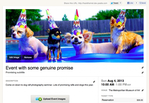
You can zoom the image in and out, move the image around, and show more or less of it by dragging the bottom of the frame up and down.
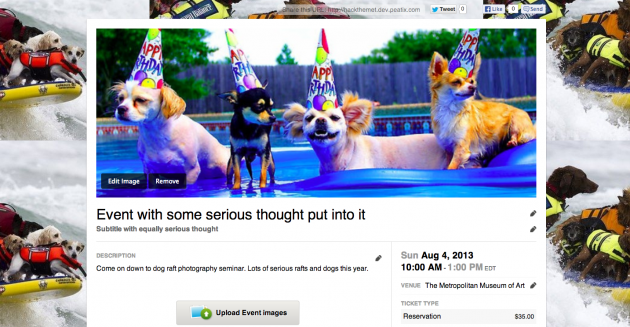
Onwards! The next step in event page freshiness—and this is getting rather advanced—is to add background to your page. This can take the form of simply another color, an image, or a tiled (repeated) image. To achieve new background, hover over “Edit” then click “Design”. Here you’ll be able to choose what color or image will serve as your page’s background.
So we arrive at the last step in ultimate, divine event page freshness. In turns out you can actually upload photos in the description as well, which is a great place to put event photos from previous years, photos of the venue, or prominent attendees.
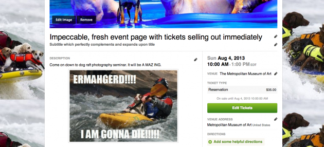
Thus you have witnessed how a page that originally was a potential turn off has turned into a near irresistible event. It takes but a minute a two, and can make a serious difference in ticket sales and attendee enthusiasm for your event. Go freshen up like your life depends on it!

